VocabBuilder Redesign
Redesigning an educational vocabulary building app
This case study provides an overview of the key objectives, challenges, and proposed solutions of the VocabularyBuilder app concept project, showcasing a forward-thinking approach taken to redefine vocabulary education in our digital age
Roles
- During this concept project, I assumed the following roles:
- User Experience (UX) Designer
- User Interface (UX) Designer
Deliverables
- User interviews
- Usability testing
- Affinity mapping
- User personas
- Wireframes
- Hi-fi prototypes
Specs
- Length: 6 weeks
- Tools used:
- Figma
- Notion
- Miro
Opportunity
Vocabulary Builder's original app had the following problems:
- Outdated design
- Hard-to-reach buttons
- Confusing information hierachy
- Lack of progress tracking
- No Incentives to engage
Solution
I revamped the original design by implementing the following changes:
- Brighter, cleaner aesthetics with easily accessible navigation
- Visual hierarchy drawing focus on most important elements
- Onboarding tips assisting first time users
- Introduction of non-academic categories for an equitable experience
- New question and quiz prompts
- Daily streak count
- New Explore page and Progress Analytics section
The approach
5 step process
I adopted the 5-step design model because of its structured and iterative nature, which suited my design process. This approach allowed me to prioritize the user's needs at each stage, resulting in valuable insights, creative ideas, and refined designs that enhanced the overall user experience

Gathering user data: Initial product research
Pre-testing
- Uncovered demographics
- Identified the existing solutions that are utilized to build vocabulary skills
- Inquired about user’s prior knowledge relating to the product
Testing
- Observed behavior while users interacted with the product
- Inquired about user motivations for behaviors
Testing
- Uncovered the end-to-end user experience by asking qualitative questions
- Concluded interviews with a questionnaire of overall user impression of the product
Discovering patterns and themes
Affinity mapping
After conducting the interviews and usability tests, I organized user feedback by analyzing user responses and grouping them into one of three categories: Pain points, Needs, or Goals. In doing so, I transformed bulky data into manageable and informative sets that provided essential insights for the objectives of the project

Spotlighting pain points
Equity
- Non-student users did not feel represented by the app and majority stated they would not use the application again
Monotony
- 76% of users said they were bored of the app after a short time
Usability
- 7 out of 9 respondents stated the navigation buttons were either difficult to use or did not work
- 5 out of 9 respondents reported feeling lost in the app at least once
Visual design
- Majority of respondents reported feeling not impressed/indifferent to the original app’s visual design interface
Analyzing the competition
Competitive analysis of vocabulary building products
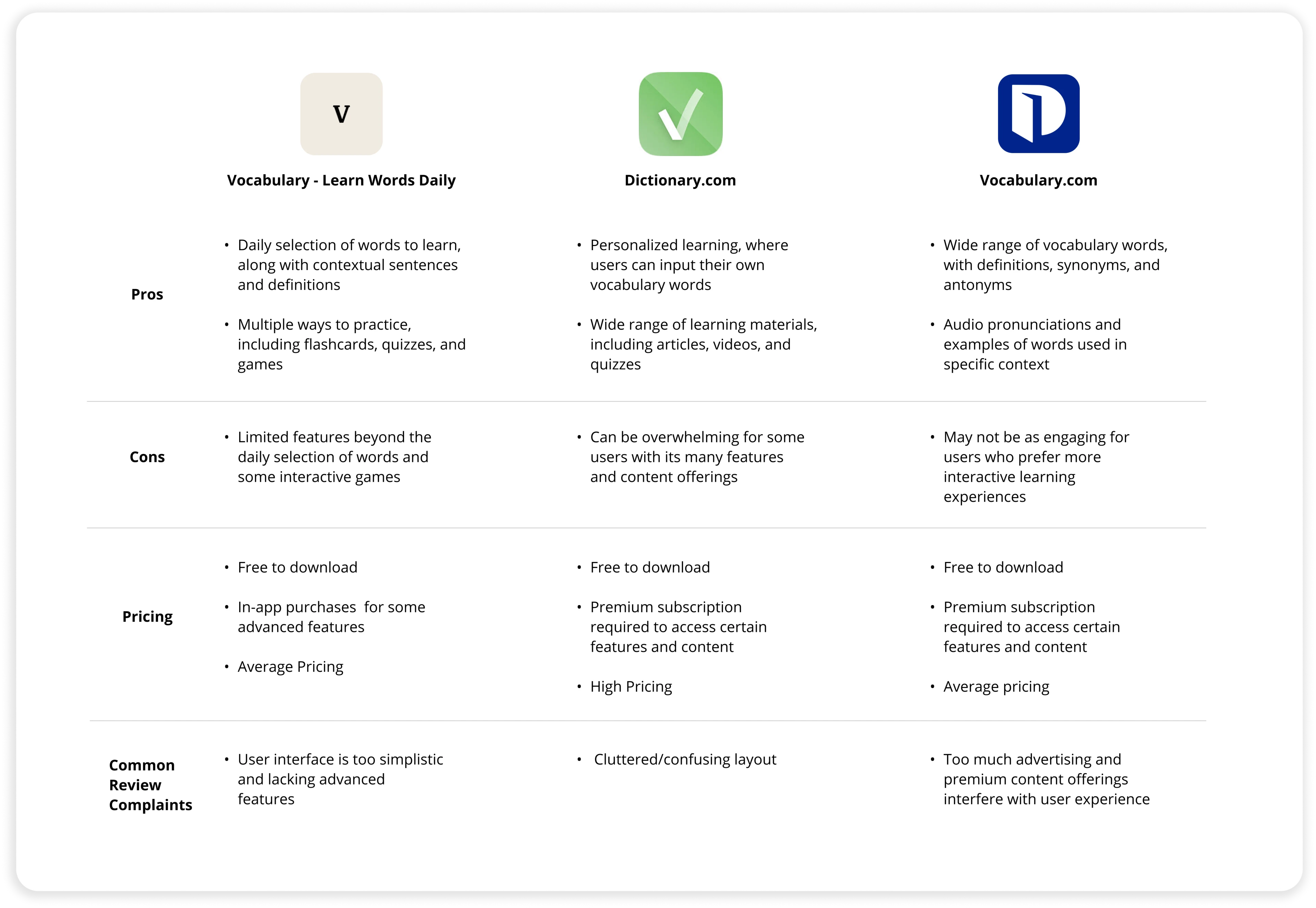
I conducted a market research assessment by analyzing resources that aim to help users improve vocabulary skills. I found that Dictionary.com and Vocabulary.com did not meet our user needs by lacking fun and engaging learning games, while Vocabulary Daily Word Learner had limited customizability that hindered users from focusing on specific vocabulary terms - a goal that was important to our intended target audience. By leveraging the pros and cons of each competitor, I was able to further understand the motivations of users choosing competing options instead of VocabularyBuilder, while also learning about opportunities that would help VocabularyBuilder stand out in the current market

Defining design constraits
Understanding limitations
Before ideating on changes, I considered how the VocabBuilder redesign can feel more modern & intuitive while preserving brand recognizability.
My goal was for existing and past users to feel excited about the redesign, but not overwhelmed from too many changes that feel unfamiliar and distant from the brand they’ve trusted for years

Building empathy for informed decisions
User personas
After gathering user data, I created two personas: Jonah & Amelia.
These user personas served as a compass throughout the entire development process. They acted as a constant reminder of who I was designing for and helping me remain focused on meeting their needs rather than getting caught up in personal opinions or assumptions.


Testing sketches before building
Wireframing
By mapping out the user flow and interaction patterns through wireframes, I identified any potential usability issues or areas of improvement early on in the process.
Additionally, creating wireframes allowed me to focus on functionality rather than aesthetics. By stripping away the visual elements such as colors and typography, I was able to concentrate on arranging key elements and ensuring efficient navigation within the app

Iterating and refining
Visualizing through lo-fi prototyping
Creating lo-fi prototypes allowed me to bring my data-backed ideas to life, test them out, and gather valuable feedback before investing too much time and effort into the final product. I focused on creating visual contrast, intuitive flows, and efficient usability for our target user

A/B Testing to find what works
To quantitatively review the designs, I presented varying lo-fi screens to participants and iterated on the product based on their feedback. I repeated this process until the participant responses validated the best design choice moving forward.
Below are examples of the various iterations made to the home screen based on user feedback. Although multiple versions were needed to gauge preferences, the changes ultimately led to a refined solution that cut out unnecessary fluff

Refreshing the brand identity
Revamped UI
My main goal with the UI redesign was to maintain brand recognizability and consistency, while conveying a refreshed, modern aesthetic that is inviting to new and existing users. To do so, I adopted muted hues of the original primary colors (purple and green) to tone down the intensity, alleviate eye strain, and create a more uniform color contrast throughout the app experience. Additionally, I introduced simple icons and button variations to serve as tools for navigating the redesigned product. Lastly, I reimagined the company logo by simplifying the existing checkmark icon concept

Final design
Something
The redesign of the VocabularyBuilder app has resulted in a fresh and intuitive interface that enhances the overall learning experience. With a focus on simplicity and clarity, the final designs offer a visually appealing and modern look, while maintaining the core functionality of the app. The home screen welcomes users with a personalized message, prominently featuring various lessons and offering quick access to key features. The word search and flashcard modules have been revamped to provide a more engaging experience with a progress bar and health life count while an introduction of a ‘discover’ page provides learning resources that encourage further education relating to vocabulary proficiency


Key takeaways
Biggest lessons
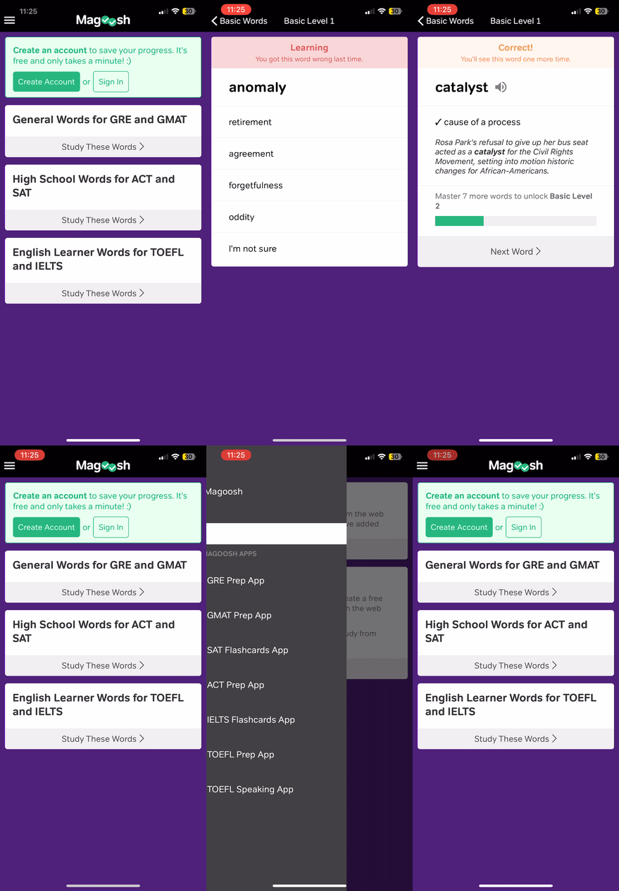
- Conducting usability testing of the original app design proved to be instrumental in the design choices for the redesign. For example, all users struggled with the navigation buttons, which made it a clear pain-point that needed to be addressed
- Users appreciate visualizing their progress. The gathered feedback indicated that users value the option to view their growth through visuals and that they felt more motivated to continue engaging with the app content
- Looking back, I believe I could have saved time by conducting AB testing with wireframes rather than lo-fi prototypes as they would have been a faster option to iterate and present to the participants
Opportunities for improvement
Considering long term development, I would like to conduct further user research to understand how users interact with the redesign long term. For example, how often do users read the articles in the discover section? Do former students continue using the app when they don’t need to study for test? How well do users retain the information they learn? These would be some of the questions that could provide essential information on how the app could continue improving and ensuring various different users get the most utility from the product